|
|
Banksy Stop and Search Print, by rurualhick on Feb 11, 2008 5:39:56 GMT 1, I AM ADDING SOMETHING POSITIVE BY SAYING A LOT OF THESE FRAME JOBS ARE EYESORES. THIS MIGHT ENABLE SOMEBODY IN THE FUTURE TO DO THIS PRINT JUSTICE AND NOT DESTROY IT WITH A VISUALLY CATASTROPHIC FRAME.
I AM ADDING SOMETHING POSITIVE BY SAYING A LOT OF THESE FRAME JOBS ARE EYESORES. THIS MIGHT ENABLE SOMEBODY IN THE FUTURE TO DO THIS PRINT JUSTICE AND NOT DESTROY IT WITH A VISUALLY CATASTROPHIC FRAME.
|
|
|
|
Banksy Stop and Search Print, by thetruth55 on Feb 11, 2008 6:02:07 GMT 1, I AM ADDING SOMETHING POSITIVE BY SAYING A LOT OF THESE FRAME JOBS ARE EYESORES. THIS MIGHT ENABLE SOMEBODY IN THE FUTURE TO DO THIS PRINT JUSTICE AND NOT DESTROY IT WITH A VISUALLY CATASTROPHIC FRAME.
again, tell us what you think would do the print justice. what would you choose for frame and matte, colors, etc.?
I AM ADDING SOMETHING POSITIVE BY SAYING A LOT OF THESE FRAME JOBS ARE EYESORES. THIS MIGHT ENABLE SOMEBODY IN THE FUTURE TO DO THIS PRINT JUSTICE AND NOT DESTROY IT WITH A VISUALLY CATASTROPHIC FRAME. again, tell us what you think would do the print justice. what would you choose for frame and matte, colors, etc.? |
|
|
|
Banksy Stop and Search Print, by rurualhick on Feb 11, 2008 6:14:48 GMT 1, LESSON 1 - MINIMALISTIC FRAME IS A MUST. AVOID ANYTHING ORNAMENTAL. OF COURSE MOST ON HERE GO TO THE BLASPHEMY EXTREME OF GOING GAUDY. TOTALLY KILLING THE ARTWORK BY HAVING YOUR EYES FOCUS ON THE FOOKN' UGLY FRAME RATHER THAN THE ART. Y'ALL SHOULD TAKE A 101 COURSE IN BASIC CONCEPTS IN ART AND DESIGN.
LESSON 1 - MINIMALISTIC FRAME IS A MUST. AVOID ANYTHING ORNAMENTAL. OF COURSE MOST ON HERE GO TO THE BLASPHEMY EXTREME OF GOING GAUDY. TOTALLY KILLING THE ARTWORK BY HAVING YOUR EYES FOCUS ON THE FOOKN' UGLY FRAME RATHER THAN THE ART. Y'ALL SHOULD TAKE A 101 COURSE IN BASIC CONCEPTS IN ART AND DESIGN.
|
|
mp
New Member

🗨️ 253
👍🏻 39
November 2006
|
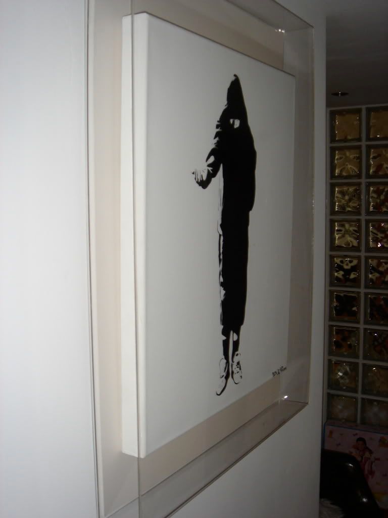
Banksy Stop and Search Print, by mp on Feb 11, 2008 6:23:13 GMT 1, I went with the seemingly unpopular white box frame with a float mount to see the deckled edge, but that being said I think everyone's looks great and framing choices are the same as art itself. Not everything will appeal to everyone, so buy the one that makes you happiest.
To answer your other question, I never used to frame my pieces in white, until I saw some of Faile's work in white box frames at a gallery and was blown away by how much emphasis it puts on on each piece itself. Been doing it ever since.
With Stop and Search, I kind of just love how the image feels like it comes out of nowhere amidst all the white.
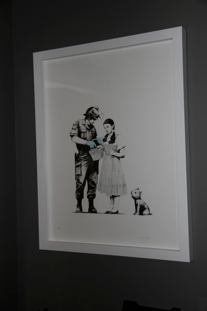
I went with the seemingly unpopular white box frame with a float mount to see the deckled edge, but that being said I think everyone's looks great and framing choices are the same as art itself. Not everything will appeal to everyone, so buy the one that makes you happiest. To answer your other question, I never used to frame my pieces in white, until I saw some of Faile's work in white box frames at a gallery and was blown away by how much emphasis it puts on on each piece itself. Been doing it ever since. With Stop and Search, I kind of just love how the image feels like it comes out of nowhere amidst all the white.  |
|
|
|
Banksy Stop and Search Print, by thetruth55 on Feb 11, 2008 6:27:14 GMT 1, LESSON 1 - MINIMALISTIC FRAME IS A MUST. AVOID ANYTHING ORNAMENTAL. OF COURSE MOST ON HERE GO TO THE BLASPHEMY EXTREME OF GOING GAUDY. TOTALLY KILLING THE ARTWORK BY HAVING YOUR EYES FOCUS ON THE FOOKN' UGLY FRAME RATHER THAN THE ART. Y'ALL SHOULD TAKE A 101 COURSE IN BASIC CONCEPTS IN ART AND DESIGN.
okay, so the frame part is out of the way.
now, what colors of matte would you do...or are you a floating type of guy? keep in mind there is a lot of negative space in this print.
LESSON 1 - MINIMALISTIC FRAME IS A MUST. AVOID ANYTHING ORNAMENTAL. OF COURSE MOST ON HERE GO TO THE BLASPHEMY EXTREME OF GOING GAUDY. TOTALLY KILLING THE ARTWORK BY HAVING YOUR EYES FOCUS ON THE FOOKN' UGLY FRAME RATHER THAN THE ART. Y'ALL SHOULD TAKE A 101 COURSE IN BASIC CONCEPTS IN ART AND DESIGN. okay, so the frame part is out of the way. now, what colors of matte would you do...or are you a floating type of guy? keep in mind there is a lot of negative space in this print. |
|
Curley
Junior Member

🗨️ 2,012
👍🏻 7
June 2006
|
Banksy Stop and Search Print, by Curley on Feb 11, 2008 11:48:32 GMT 1, LESSON 1 - MINIMALISTIC FRAME IS A MUST. AVOID ANYTHING ORNAMENTAL. OF COURSE MOST ON HERE GO TO THE BLASPHEMY EXTREME OF GOING GAUDY. TOTALLY KILLING THE ARTWORK BY HAVING YOUR EYES FOCUS ON THE FOOKN' UGLY FRAME RATHER THAN THE ART. Y'ALL SHOULD TAKE A 101 COURSE IN BASIC CONCEPTS IN ART AND DESIGN.
People have different tastes my friend and you should respect that. 
LESSON 1 - MINIMALISTIC FRAME IS A MUST. AVOID ANYTHING ORNAMENTAL. OF COURSE MOST ON HERE GO TO THE BLASPHEMY EXTREME OF GOING GAUDY. TOTALLY KILLING THE ARTWORK BY HAVING YOUR EYES FOCUS ON THE FOOKN' UGLY FRAME RATHER THAN THE ART. Y'ALL SHOULD TAKE A 101 COURSE IN BASIC CONCEPTS IN ART AND DESIGN. People have different tastes my friend and you should respect that.  |
|
|
|
ak47tos
New Member

🗨️ 147
👍🏻 7
October 2007
|
Banksy Stop and Search Print, by ak47tos on Feb 11, 2008 12:19:29 GMT 1, I went with the seemingly unpopular white box frame with a float mount to see the deckled edge, but that being said I think everyone's looks great and framing choices are the same as art itself. Not everything will appeal to everyone, so buy the one that makes you happiest. To answer your other question, I never used to frame my pieces in white, until I saw some of Faile's work in white box frames at a gallery and was blown away by how much emphasis it puts on on each piece itself. Been doing it ever since. With Stop and Search, I kind of just love how the image feels like it comes out of nowhere amidst all the white.  That image seems to 'pop' out! Lovely framing idea, simple yet timeless! ;D (I wish I had the print!)
IMO that's the one. This looks really great, cheers for the pic.
I went with the seemingly unpopular white box frame with a float mount to see the deckled edge, but that being said I think everyone's looks great and framing choices are the same as art itself. Not everything will appeal to everyone, so buy the one that makes you happiest. To answer your other question, I never used to frame my pieces in white, until I saw some of Faile's work in white box frames at a gallery and was blown away by how much emphasis it puts on on each piece itself. Been doing it ever since. With Stop and Search, I kind of just love how the image feels like it comes out of nowhere amidst all the white.  That image seems to 'pop' out! Lovely framing idea, simple yet timeless! ;D (I wish I had the print!) IMO that's the one. This looks really great, cheers for the pic. |
|
|
|
Banksy Stop and Search Print, by buffin on Feb 11, 2008 19:48:02 GMT 1, Really nice to see these framed up and people taking so much care in their frame choices. Just goes to prove that they aren't all in tubes or on the bay.
LESSON 1 - MINIMALISTIC FRAME IS A MUST. AVOID ANYTHING ORNAMENTAL. OF COURSE MOST ON HERE GO TO THE BLASPHEMY EXTREME OF GOING GAUDY. TOTALLY KILLING THE ARTWORK BY HAVING YOUR EYES FOCUS ON THE FOOKN' UGLY FRAME RATHER THAN THE ART. Y'ALL SHOULD TAKE A 101 COURSE IN BASIC CONCEPTS IN ART AND DESIGN.
Lesson 2 - Urban art does follow rules or basic concepts!
Really nice to see these framed up and people taking so much care in their frame choices. Just goes to prove that they aren't all in tubes or on the bay. LESSON 1 - MINIMALISTIC FRAME IS A MUST. AVOID ANYTHING ORNAMENTAL. OF COURSE MOST ON HERE GO TO THE BLASPHEMY EXTREME OF GOING GAUDY. TOTALLY KILLING THE ARTWORK BY HAVING YOUR EYES FOCUS ON THE FOOKN' UGLY FRAME RATHER THAN THE ART. Y'ALL SHOULD TAKE A 101 COURSE IN BASIC CONCEPTS IN ART AND DESIGN. Lesson 2 - Urban art does follow rules or basic concepts! |
|
otomi
Junior Member

🗨️ 1,805
👍🏻 169
July 2007
|
Banksy Stop and Search Print, by otomi on Feb 12, 2008 0:10:53 GMT 1, LESSON 1 - MINIMALISTIC FRAME IS A MUST. AVOID ANYTHING ORNAMENTAL. OF COURSE MOST ON HERE GO TO THE BLASPHEMY EXTREME OF GOING GAUDY. TOTALLY KILLING THE ARTWORK BY HAVING YOUR EYES FOCUS ON THE FOOKN' UGLY FRAME RATHER THAN THE ART. Y'ALL SHOULD TAKE A 101 COURSE IN BASIC CONCEPTS IN ART AND DESIGN.
So we should all frame our prints the way you like it. Sounds great. I think often the idea is to have a street art motive in a fancy print. Not a new idea but can work very well.
LESSON 1 - MINIMALISTIC FRAME IS A MUST. AVOID ANYTHING ORNAMENTAL. OF COURSE MOST ON HERE GO TO THE BLASPHEMY EXTREME OF GOING GAUDY. TOTALLY KILLING THE ARTWORK BY HAVING YOUR EYES FOCUS ON THE FOOKN' UGLY FRAME RATHER THAN THE ART. Y'ALL SHOULD TAKE A 101 COURSE IN BASIC CONCEPTS IN ART AND DESIGN. So we should all frame our prints the way you like it. Sounds great. I think often the idea is to have a street art motive in a fancy print. Not a new idea but can work very well. |
|
funyoung
Junior Member

🗨️ 1,040
👍🏻 20
February 2008
|
Banksy Stop and Search Print, by funyoung on Feb 12, 2008 12:05:58 GMT 1, LESSON 1 - MINIMALISTIC FRAME IS A MUST. AVOID ANYTHING ORNAMENTAL. OF COURSE MOST ON HERE GO TO THE BLASPHEMY EXTREME OF GOING GAUDY. TOTALLY KILLING THE ARTWORK BY HAVING YOUR EYES FOCUS ON THE FOOKN' UGLY FRAME RATHER THAN THE ART. Y'ALL SHOULD TAKE A 101 COURSE IN BASIC CONCEPTS IN ART AND DESIGN.
Blimey thanks for the insight.
I completely missed the point of this print it seems.
I thought it featured Dorothy from the Wizard of Oz, written in 1900 and turned into a film in 1939. I'm ignoring the policeman as I think Dorothy is the star of the piece. They would have therefore definitely used a minimalist frame in that case - no 'ornamental' frames back then - or were there?
I have rung the local adult education centre but they don't have 'Basic Concepts in Art and Design 101' and even asked what '101' meant as we are English. I was thus wondering if you could give me some pointers RuralHick? I was particularly interested in the use of colour in your minimalist frames - or is it just white frame, white mount, white wall, and whitewash anyone else who wants to do something different?
I do like the white frames above but equally like some of the others.
Eagerly awaiting you reply HickUp,
yours sincerely,
Andrew Youngus Maximus III Jr.
LESSON 1 - MINIMALISTIC FRAME IS A MUST. AVOID ANYTHING ORNAMENTAL. OF COURSE MOST ON HERE GO TO THE BLASPHEMY EXTREME OF GOING GAUDY. TOTALLY KILLING THE ARTWORK BY HAVING YOUR EYES FOCUS ON THE FOOKN' UGLY FRAME RATHER THAN THE ART. Y'ALL SHOULD TAKE A 101 COURSE IN BASIC CONCEPTS IN ART AND DESIGN. Blimey thanks for the insight. I completely missed the point of this print it seems. I thought it featured Dorothy from the Wizard of Oz, written in 1900 and turned into a film in 1939. I'm ignoring the policeman as I think Dorothy is the star of the piece. They would have therefore definitely used a minimalist frame in that case - no 'ornamental' frames back then - or were there? I have rung the local adult education centre but they don't have 'Basic Concepts in Art and Design 101' and even asked what '101' meant as we are English. I was thus wondering if you could give me some pointers RuralHick? I was particularly interested in the use of colour in your minimalist frames - or is it just white frame, white mount, white wall, and whitewash anyone else who wants to do something different? I do like the white frames above but equally like some of the others. Eagerly awaiting you reply HickUp, yours sincerely, Andrew Youngus Maximus III Jr. |
|
lee100
New Member

🗨️ 233
👍🏻 114
April 2007
|
Banksy Stop and Search Print, by lee100 on Feb 12, 2008 12:35:30 GMT 1, Love Mp's S&S, Just mailed Misterframerman to have mine done like this
Love Mp's S&S, Just mailed Misterframerman to have mine done like this
|
|
|
|
Banksy Stop and Search Print, by howlinhooker on Feb 12, 2008 12:46:04 GMT 1, white is best !!!!!!!!!!!!!!!!!!!!!!!!
white is best !!!!!!!!!!!!!!!!!!!!!!!!
|
|
njr911
Junior Member

🗨️ 2,381
👍🏻 420
April 2007
|
Banksy Stop and Search Print, by njr911 on Feb 12, 2008 12:49:01 GMT 1, yup that's how mine is going to be done!
yup that's how mine is going to be done!
|
|
jonvespa
New Member

🗨️ 858
👍🏻 204
December 2006
|
Banksy Stop and Search Print, by jonvespa on Feb 12, 2008 16:08:52 GMT 1, mine:
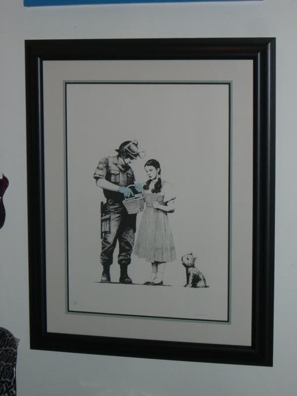
mine:  |
|
|
|
|
|
Banksy Stop and Search Print, by thetruth55 on Feb 12, 2008 17:09:55 GMT 1, jonvespa, that looks nice. how much did that run you? it is tough finding the right matte to match the blue gloves, huh? i should have mine back from the framer any day and i actually think i found an exact matching matte. i'll post pics when it comes in.
jonvespa, that looks nice. how much did that run you? it is tough finding the right matte to match the blue gloves, huh? i should have mine back from the framer any day and i actually think i found an exact matching matte. i'll post pics when it comes in.
|
|
|
|
Banksy Stop and Search Print, by rurualhick on Feb 12, 2008 18:34:44 GMT 1, BAD BUT NOT AS BAD AS SOME OF THE OTHERS.
BAD BUT NOT AS BAD AS SOME OF THE OTHERS.
|
|
bill
New Member

🗨️ 444
👍🏻 0
November 2007
|
Banksy Stop and Search Print, by bill on Feb 12, 2008 18:38:47 GMT 1, BAD BUT NOT AS BAD AS SOME OF THE OTHERS.
Hey HICK, you are pretty negative. Let's see some of your stuff. Most of your posts have a negative vibe to them. What gives?
PS: Jonvespa: looks great
BAD BUT NOT AS BAD AS SOME OF THE OTHERS. Hey HICK, you are pretty negative. Let's see some of your stuff. Most of your posts have a negative vibe to them. What gives? PS: Jonvespa: looks great |
|
|
|
Banksy Stop and Search Print, by rurualhick on Feb 12, 2008 18:42:35 GMT 1, I ONLY PROVIDE QUANTIFIABLE ANALYSIS OF WHAT I OBSERVE
I ONLY PROVIDE QUANTIFIABLE ANALYSIS OF WHAT I OBSERVE
|
|
bill
New Member

🗨️ 444
👍🏻 0
November 2007
|
Banksy Stop and Search Print, by bill on Feb 12, 2008 18:46:53 GMT 1, I can be positive as well.....
I can be positive as well.....
|
|
|
|
Banksy Stop and Search Print, by thetruth55 on Feb 14, 2008 22:20:54 GMT 1, Well, since I started this thread, I'd like to share my Stop and Search...just got it back from the framer's. This is my first signed Banksy and the first Banksy I've had framed so far. I went with TrueView Museum glass, archival mattes, mylar corners on the backing....I think I was fairly lucky in getting an outer matte that is nearly an exact match to the color of the officer's gloves. My reasoning for my selection....lots of white negative space in the image...thought the first black matte would nicely outline the image (i.e. draw you in), and the second matte was to highlight the obvious - the latex gloves. Please let me know what you all think. I suppose I can already expect "rurualhick" to say it is hideous....but anyway, all comments are welcome...I like it so that's all that matters. Thanks to everyone else for contributing their photos here as well - they all look superb!
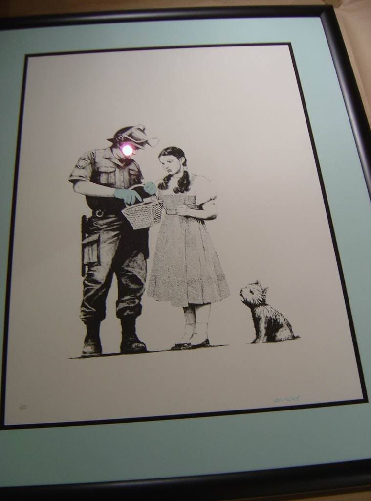
Well, since I started this thread, I'd like to share my Stop and Search...just got it back from the framer's. This is my first signed Banksy and the first Banksy I've had framed so far. I went with TrueView Museum glass, archival mattes, mylar corners on the backing....I think I was fairly lucky in getting an outer matte that is nearly an exact match to the color of the officer's gloves. My reasoning for my selection....lots of white negative space in the image...thought the first black matte would nicely outline the image (i.e. draw you in), and the second matte was to highlight the obvious - the latex gloves. Please let me know what you all think. I suppose I can already expect "rurualhick" to say it is hideous....but anyway, all comments are welcome...I like it so that's all that matters. Thanks to everyone else for contributing their photos here as well - they all look superb!  |
|
stuey09
New Member

🗨️ 49
👍🏻 1
August 2008
|
Banksy Stop and Search Print, by stuey09 on Feb 14, 2008 22:25:04 GMT 1, Well done the truth. Nice to see one framed for a change.
Well done the truth. Nice to see one framed for a change.
|
|
|
|
Banksy Stop and Search Print, by foundation on Feb 14, 2008 22:25:32 GMT 1, That works really well, nice one, its an idea to try that matching with others. Someone had some nice inner red mounts to go with their rats, which was also quite nice. Someone else has a very BLUE J&J, ( cracka?). Top work fella.
That works really well, nice one, its an idea to try that matching with others. Someone had some nice inner red mounts to go with their rats, which was also quite nice. Someone else has a very BLUE J&J, ( cracka?). Top work fella.
|
|
|
|
|
|
Banksy Stop and Search Print, by buffin on Feb 14, 2008 22:28:24 GMT 1, Really nice job. Well done you.
Really nice job. Well done you.
|
|
|
|
Banksy Stop and Search Print, by thetruth55 on Feb 14, 2008 22:33:39 GMT 1, Stuey09, foundation, and buffin...thank you very much for the nice words...that means a lot coming from top-notch board members such as yourselves.
Stuey09, foundation, and buffin...thank you very much for the nice words...that means a lot coming from top-notch board members such as yourselves.
|
|
skelly
New Member

🗨️ 616
👍🏻 0
February 2008
|
Banksy Stop and Search Print, by skelly on Feb 15, 2008 3:15:18 GMT 1, Kept mine simple 
I needed some inspiration for my frame, I will be using this
Kept mine simple  I needed some inspiration for my frame, I will be using this |
|
pezlow
Junior Member
  
🗨️ 5,388
👍🏻 254
January 2007
|
Banksy Stop and Search Print, by pezlow on Feb 15, 2008 7:21:43 GMT 1, Like that thetruth. Glad you are pleased with it. As stuey says it is nice to see so many of these being framed. I know opinions were divided about this print but I think it's great.
Like that thetruth. Glad you are pleased with it. As stuey says it is nice to see so many of these being framed. I know opinions were divided about this print but I think it's great.
|
|
Harveyn
Full Member
   
🗨️ 7,743
👍🏻 4,899
July 2007
|
Banksy Stop and Search Print, by Harveyn on Feb 15, 2008 8:22:54 GMT 1, I ONLY PROVIDE QUANTIFIABLE ANALYSIS OF WHAT I OBSERVE
Whats quantifiable about it? What makes your opinion the correct approach and all others an indictment of their art taste? Why not simply state your preference than assume yourself to be the leading authority on frames and art taste?
Just for you two contrasting frames that IMO work well. Note IMO thus suggesting I am quite happy for others to prefer something different. Making neither their or my opinion right or wrong.
"BLASPHEMY EXTREME OF GOING GAUDY"
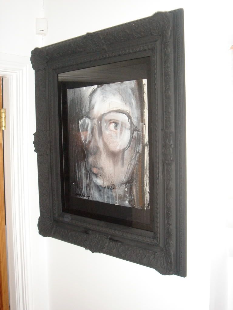
I ONLY PROVIDE QUANTIFIABLE ANALYSIS OF WHAT I OBSERVE Whats quantifiable about it? What makes your opinion the correct approach and all others an indictment of their art taste? Why not simply state your preference than assume yourself to be the leading authority on frames and art taste? Just for you two contrasting frames that IMO work well. Note IMO thus suggesting I am quite happy for others to prefer something different. Making neither their or my opinion right or wrong. "BLASPHEMY EXTREME OF GOING GAUDY"   |
|
|
|
Banksy Stop and Search Print, by rurualhick on Feb 15, 2008 9:42:57 GMT 1, ART IS FOR THE MOST PART SUBJECTIVE. HOWEVER, THERE ARE BASIC PRINCIPLES ie. color theory THAT ARE NOT SUBJECTIVE BUT ARE INSTEAD FUNDAMENTAL TO VISUAL APPEASEMENT. LOOKING AT MOST OF THESE ITS CLEAR THE FUNDAMENTALS HAVE BEEN BASTARDIZED. SEEMS MOST CAN'T COMPREHEND THAT MANY TIMES "MORE IS LESS". UNFORTUNATELY THIS VIOLATION HAS BEEN TAKEN TO AN EXTREME IN MANY INSTANCES.
ART IS FOR THE MOST PART SUBJECTIVE. HOWEVER, THERE ARE BASIC PRINCIPLES ie. color theory THAT ARE NOT SUBJECTIVE BUT ARE INSTEAD FUNDAMENTAL TO VISUAL APPEASEMENT. LOOKING AT MOST OF THESE ITS CLEAR THE FUNDAMENTALS HAVE BEEN BASTARDIZED. SEEMS MOST CAN'T COMPREHEND THAT MANY TIMES "MORE IS LESS". UNFORTUNATELY THIS VIOLATION HAS BEEN TAKEN TO AN EXTREME IN MANY INSTANCES.
|
|
pelle
New Member

🗨️ 626
👍🏻 56
May 2007
|
Banksy Stop and Search Print, by pelle on Feb 15, 2008 9:51:56 GMT 1, ART IS FOR THE MOST PART SUBJECTIVE. HOWEVER, THERE ARE BASIC PRINCIPLES ie. color theory THAT ARE NOT SUBJECTIVE BUT ARE INSTEAD FUNDAMENTAL TO VISUAL APPEASEMENT. LOOKING AT MOST OF THESE ITS CLEAR THE FUNDAMENTALS HAVE BEEN BASTARDIZED. SEEMS MOST CAN'T COMPREHEND THAT MANY TIMES "MORE IS LESS". UNFORTUNATELY THIS VIOLATION HAS BEEN TAKEN TO AN EXTREME IN MANY INSTANCES.
Two things here. While it is true that there are basic principles of colour theory, this IS just that - theory. Because the way people perceive different colours is still subjective. So while it may be clear to your sensibilities that "the fundamentals have been bastardized" it might not seem so to everyone else in the world.
And secondly I believe the saying is "less is more" 
ART IS FOR THE MOST PART SUBJECTIVE. HOWEVER, THERE ARE BASIC PRINCIPLES ie. color theory THAT ARE NOT SUBJECTIVE BUT ARE INSTEAD FUNDAMENTAL TO VISUAL APPEASEMENT. LOOKING AT MOST OF THESE ITS CLEAR THE FUNDAMENTALS HAVE BEEN BASTARDIZED. SEEMS MOST CAN'T COMPREHEND THAT MANY TIMES "MORE IS LESS". UNFORTUNATELY THIS VIOLATION HAS BEEN TAKEN TO AN EXTREME IN MANY INSTANCES. Two things here. While it is true that there are basic principles of colour theory, this IS just that - theory. Because the way people perceive different colours is still subjective. So while it may be clear to your sensibilities that "the fundamentals have been bastardized" it might not seem so to everyone else in the world. And secondly I believe the saying is "less is more"  |
|
Harveyn
Full Member
   
🗨️ 7,743
👍🏻 4,899
July 2007
|
Banksy Stop and Search Print, by Harveyn on Feb 15, 2008 10:14:05 GMT 1, "Colour theory of Art" is more to do with basic colour concepts that can or cannot be used when constructing an image. Since when has art been solely about visual appeasement. Do you seriously believe that some of the most creative artist of our time did not purposely work with exactly the opposite concept in mind to create an image from colours that intentionally produce conflict.
Your not picking Dulex colour swatches for your bedroom.
Besides which please indicate the countless examples that you refer to that break this colour theory and also can you possibly take your caps lock off.
"Colour theory of Art" is more to do with basic colour concepts that can or cannot be used when constructing an image. Since when has art been solely about visual appeasement. Do you seriously believe that some of the most creative artist of our time did not purposely work with exactly the opposite concept in mind to create an image from colours that intentionally produce conflict.
Your not picking Dulex colour swatches for your bedroom.
Besides which please indicate the countless examples that you refer to that break this colour theory and also can you possibly take your caps lock off.
|
|


