|
|
New pieces - constructive crit much appreciated, by unseenartist on Oct 21, 2009 15:25:36 GMT 1, 
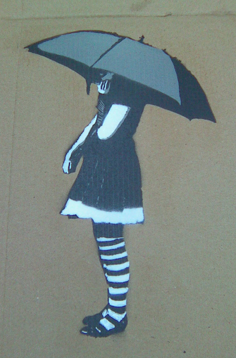
1. This one's a few months old. Tribute to the late Jade Goody, based on (shamelessly ripped off) Klimt's "The Kiss" Just thought I'd post it anyway, though it's the following two that are in my new series. This one's just called, "The Ki$$" Original, I know...

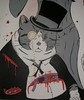
2. Seven dwarves as insurgents. No title as yet...any suggestions?

3. "I f***ing Thirst!" Jesus, and a bottle of WKD. Need I say more?
(Not quite finished, I have awful habit of leaving things half done and never coming back)
Hope you like, they do make sense when in the context of the series, honest!
Charlotte - unseenartist -
1. This one's a few months old. Tribute to the late Jade Goody, based on (shamelessly ripped off) Klimt's "The Kiss" Just thought I'd post it anyway, though it's the following two that are in my new series. This one's just called, "The Ki$$" Original, I know... 2. Seven dwarves as insurgents. No title as yet...any suggestions? 3. "I f***ing Thirst!" Jesus, and a bottle of WKD. Need I say more? (Not quite finished, I have awful habit of leaving things half done and never coming back) Hope you like, they do make sense when in the context of the series, honest! Charlotte - unseenartist - |
|
idiom
Artist
Junior Member

Posts • 1,030
Likes • 2
July 2008
|
New pieces - constructive crit much appreciated, by idiom on Oct 21, 2009 16:04:01 GMT 1, Welcome! I quite like the look of them all although my favourite touch has got to be the look on the right hand copper's face... Good work all round!
Cheers
id-iom
Welcome! I quite like the look of them all although my favourite touch has got to be the look on the right hand copper's face... Good work all round!
Cheers
id-iom
|
|
junta
New Member
Posts • 443
Likes • 6
June 2009
|
New pieces - constructive crit much appreciated, by junta on Oct 21, 2009 18:03:46 GMT 1, last one is my favourite, even though I thought I'd seen enough cop pieces  Has anyone seen that bird from the second one somewhere before? It looks familiar (other than in Disney movies) Has anyone seen that bird from the second one somewhere before? It looks familiar (other than in Disney movies)
last one is my favourite, even though I thought I'd seen enough cop pieces Has anyone seen that bird from the second one somewhere before? It looks familiar (other than in Disney movies) |
|
|
|
New pieces - constructive crit much appreciated, by fenna67 on Oct 27, 2009 14:54:42 GMT 1, Very nice....love the dwarves!!...Agree with Id-iom....look on the coppers face is priceless! Word.
Very nice....love the dwarves!!...Agree with Id-iom....look on the coppers face is priceless! Word.
|
|
|
|
New pieces - constructive crit much appreciated, by monkeyballs on Oct 27, 2009 23:29:30 GMT 1, Drop the drips, no need for them, they look too placed. The Kiss is my favourite by a long stretch, in fact I really like it. The others just feel a little bit derivative of general 'Urban' ideas and somewhat old hat.
Hope you take this constructively because essentially the work is very well executed and effort has clearly gone into it. Interested enough to ask if you're on flickr, I would be keen to follow.
Drop the drips, no need for them, they look too placed. The Kiss is my favourite by a long stretch, in fact I really like it. The others just feel a little bit derivative of general 'Urban' ideas and somewhat old hat.
Hope you take this constructively because essentially the work is very well executed and effort has clearly gone into it. Interested enough to ask if you're on flickr, I would be keen to follow.
|
|
|
|
New pieces - constructive crit much appreciated, by mrease on Oct 27, 2009 23:44:45 GMT 1, Real nice work there Charlotte. I would like to know if these are painted or collage or digital or a mixture of all medias ?
Real nice work there Charlotte. I would like to know if these are painted or collage or digital or a mixture of all medias ?
|
|
|
|
Mish Mash
Artist
New Member
Posts • 484
Likes • 1
August 2008
|
New pieces - constructive crit much appreciated, by Mish Mash on Oct 28, 2009 9:33:54 GMT 1, Like the look of them all. I too would like to know if these are painted or collage or digital or a mixture of all medias ?
junta - think (not 100%) the bird has just popped up on a recent VanDal piece
Like the look of them all. I too would like to know if these are painted or collage or digital or a mixture of all medias ? junta - think (not 100%) the bird has just popped up on a recent VanDal piece |
|
erzengel
New Member
Posts • 248
Likes • 1
September 2008
|
New pieces - constructive crit much appreciated, by erzengel on Oct 29, 2009 10:57:44 GMT 1, Like the look too specially the first one. Would also likte to know how it's executed.
Like the look too specially the first one. Would also likte to know how it's executed.
|
|
|
|
New pieces - constructive crit much appreciated, by unseenartist on Nov 1, 2009 23:40:13 GMT 1, Hey thanks guys for the responses. @ Monkeyballs, thanks a lot for the cc, I defo agree about the drips for the dwarves, however I think a lot of them on Jesus work, and without them it'd be a tad bare, but I reckon I should have toned them down/not done so many - I totally agree it's "somewhat old hat" in the sense that lots of works like this feature drips or whatever effects which appear to be tacked on for the sake of it, and because that's what the artist has seen in graffiti work. Same with me, I've seen the style and loved it, but I do always try to keep it my own and not just do something for the sake of doing it. That said, I'm a young artist, just starting out and I'm nowhere near finding my own style yet, so a lot of the stuff I'm doing now I'll totally dismiss in a few years, for the reasons you've stated. Cheers! Don't have a flickr but website/blog soon hopefully, I'll keep you posted. Thanks for the interest.
For everyone interested -
"The Ki$$" was acrylic on wood with sprayed stencils - Montana Gold (it's the first and only brand I've ever used, only just starting out)
The dwarves and the Jesus piece were both oil on wood, with spray drips and stencils. Sharpie paint markers used for black/white outlines.
Anyone wants to know more, just ask!
Cheers guys, Charlotte
Hey thanks guys for the responses. @ Monkeyballs, thanks a lot for the cc, I defo agree about the drips for the dwarves, however I think a lot of them on Jesus work, and without them it'd be a tad bare, but I reckon I should have toned them down/not done so many - I totally agree it's "somewhat old hat" in the sense that lots of works like this feature drips or whatever effects which appear to be tacked on for the sake of it, and because that's what the artist has seen in graffiti work. Same with me, I've seen the style and loved it, but I do always try to keep it my own and not just do something for the sake of doing it. That said, I'm a young artist, just starting out and I'm nowhere near finding my own style yet, so a lot of the stuff I'm doing now I'll totally dismiss in a few years, for the reasons you've stated. Cheers! Don't have a flickr but website/blog soon hopefully, I'll keep you posted. Thanks for the interest.
For everyone interested -
"The Ki$$" was acrylic on wood with sprayed stencils - Montana Gold (it's the first and only brand I've ever used, only just starting out)
The dwarves and the Jesus piece were both oil on wood, with spray drips and stencils. Sharpie paint markers used for black/white outlines.
Anyone wants to know more, just ask!
Cheers guys, Charlotte
|
|
junta
New Member
Posts • 443
Likes • 6
June 2009
|
New pieces - constructive crit much appreciated, by junta on Nov 2, 2009 12:59:41 GMT 1, "The Ki$$" was acrylic on wood with sprayed stencils - Montana Gold (it's the first and only brand I've ever used, only just starting out)
The dwarves and the Jesus piece were both oil on wood, with spray drips and stencils. Sharpie paint markers used for black/white outlines."
... really
so theres no digital work in these at all, just paint you say?
"The Ki$$" was acrylic on wood with sprayed stencils - Montana Gold (it's the first and only brand I've ever used, only just starting out)
The dwarves and the Jesus piece were both oil on wood, with spray drips and stencils. Sharpie paint markers used for black/white outlines."
... really
so theres no digital work in these at all, just paint you say?
|
|
|
|
New pieces - constructive crit much appreciated, by unseenartist on Nov 2, 2009 13:07:11 GMT 1, "The Ki$$" was acrylic on wood with sprayed stencils - Montana Gold (it's the first and only brand I've ever used, only just starting out) The dwarves and the Jesus piece were both oil on wood, with spray drips and stencils. Sharpie paint markers used for black/white outlines." ... really so theres no digital work in these at all, just paint you say?
I don't know if you meant no digital work in the final pieces or within the whole process from start to finish -
The pieces are all purely oil/acrylic/spray paint on wood, and I made the stencils in Photoshop.
Cheers, Charlotte
"The Ki$$" was acrylic on wood with sprayed stencils - Montana Gold (it's the first and only brand I've ever used, only just starting out) The dwarves and the Jesus piece were both oil on wood, with spray drips and stencils. Sharpie paint markers used for black/white outlines." ... really so theres no digital work in these at all, just paint you say? I don't know if you meant no digital work in the final pieces or within the whole process from start to finish - The pieces are all purely oil/acrylic/spray paint on wood, and I made the stencils in Photoshop. Cheers, Charlotte |
|
|
|
New pieces - constructive crit much appreciated, by schlomo on Nov 2, 2009 15:10:06 GMT 1, Charlotte these are really tidy, i'm not a fan of the dwarf one personally, but still its very well executed.
Can i ask how you did the Jesus part of the third piece? is it stencils and oils mixed?
Charlotte these are really tidy, i'm not a fan of the dwarf one personally, but still its very well executed.
Can i ask how you did the Jesus part of the third piece? is it stencils and oils mixed?
|
|
|
|
Dellboyy
Artist
Junior Member
Posts • 2,729
Likes • 270
October 2006
|
New pieces - constructive crit much appreciated, by Dellboyy on Nov 2, 2009 15:33:33 GMT 1, I've never seen that version before! I recognise it from this one:

I've never seen that version before! I recognise it from this one: |
|
|
|
Deleted
Posts • 0
Likes •
January 1970
|
New pieces - constructive crit much appreciated, by Deleted on Nov 2, 2009 15:55:15 GMT 1, The bird with grenade is a classic Banksy etched. That said in this reference it suits as I believe it may be a parody of a bluebird from song of the south, so more disney fairytale twist for your buck  Banksy 

The bird with grenade is a classic Banksy etched. That said in this reference it suits as I believe it may be a parody of a bluebird from song of the south, so more disney fairytale twist for your buck Banksy |
|
|
|
New pieces - constructive crit much appreciated, by unseenartist on Nov 2, 2009 15:57:00 GMT 1, I've never seen that version before! I recognise it from this one:
Ahhh that's so strange as I've never seen this one either!! My decision to do the Disney bird with the grenade was purely cuz I saw the two little animals - the rabbit n the bird - on a Snow White pic and decided to use them with the dwarves, stick a suicide jacket on the rabbit n put a grenade in the beak of the bird. Obviously Banksy's bird is stylised in some way - but does look v like the Disney. Mine's an exact copy of Disney's. Not that I'll say I've never copied Banksy, certainly been inspired by his ideas, but never seen this bird picture before. Damn...haa!
@schlomo, Jesus and his bottle of WKD are just oil paints, sketched in detail with pencil first. Cheers, Charlotte
I've never seen that version before! I recognise it from this one: Ahhh that's so strange as I've never seen this one either!! My decision to do the Disney bird with the grenade was purely cuz I saw the two little animals - the rabbit n the bird - on a Snow White pic and decided to use them with the dwarves, stick a suicide jacket on the rabbit n put a grenade in the beak of the bird. Obviously Banksy's bird is stylised in some way - but does look v like the Disney. Mine's an exact copy of Disney's. Not that I'll say I've never copied Banksy, certainly been inspired by his ideas, but never seen this bird picture before. Damn...haa! @schlomo, Jesus and his bottle of WKD are just oil paints, sketched in detail with pencil first. Cheers, Charlotte |
|
|
|
New pieces - constructive crit much appreciated, by schlomo on Nov 2, 2009 15:59:48 GMT 1, I thought they might be after i wrote the question Charlotte.
they're really good, great stuff.
I thought they might be after i wrote the question Charlotte.
they're really good, great stuff.
|
|
Dellboyy
Artist
Junior Member
Posts • 2,729
Likes • 270
October 2006
|
New pieces - constructive crit much appreciated, by Dellboyy on Nov 2, 2009 16:06:20 GMT 1, Nice work btw... i'm quite liking the seven dwarves piece myself!
Nice work btw... i'm quite liking the seven dwarves piece myself!
|
|
kunstrasen
Artist
Junior Member
Posts • 2,173
Likes • 1,139
August 2009
|
New pieces - constructive crit much appreciated, by kunstrasen on Nov 5, 2009 12:14:09 GMT 1, Liking all three, but the 'I f***ing Thirst!' one is my favorite. I have to admit that I think it might look better without those drips. Would have gone for an angry face on the second copper as well. The one smiling irritates me a bit and doesn't go that well with the message of the piece imo.
Liking all three, but the 'I f***ing Thirst!' one is my favorite. I have to admit that I think it might look better without those drips. Would have gone for an angry face on the second copper as well. The one smiling irritates me a bit and doesn't go that well with the message of the piece imo.
|
|
|
|
New pieces - constructive crit much appreciated, by unseenartist on Nov 7, 2009 2:26:23 GMT 1, Many thanks guys for the comments, great feedback.
kunstrasen - I'd be really interested to know what you feel the message of the piece is, as quite honestly, I don't know myself what I really felt or meant when doing it, it was simply a little idea I got and just had to do - more from an aesthetic point of view I think. So would be great to know what exactly it says to you!
This is something I did earlier today - just took the photo, added in the logo, tacked on the Lego slogan "play on..." and wanted to know your thoughts. My original idea was to paint it, but i just don't know how to go about it - any ideas on what might work best?

Cheers, Charlotte
Many thanks guys for the comments, great feedback. kunstrasen - I'd be really interested to know what you feel the message of the piece is, as quite honestly, I don't know myself what I really felt or meant when doing it, it was simply a little idea I got and just had to do - more from an aesthetic point of view I think. So would be great to know what exactly it says to you! This is something I did earlier today - just took the photo, added in the logo, tacked on the Lego slogan "play on..." and wanted to know your thoughts. My original idea was to paint it, but i just don't know how to go about it - any ideas on what might work best? Cheers, Charlotte |
|
Mark Perronet
Artist
New Member
Posts • 197
Likes • 60
October 2009
|
New pieces - constructive crit much appreciated, by Mark Perronet on Nov 7, 2009 12:50:28 GMT 1, Good stuff indeed. I like the coppers expression, it keeps it a bit light and some of them are good guys, maybe it's New Year's Eve and he's being tolerant. I don't think you should worry about what it means, for me it works just because the physical attitude of Christ is so perfect for a staggering drunk.
Technically I think they are amazing.
First comment from a newbe I will stick some of mine up in a moment.
Good stuff indeed. I like the coppers expression, it keeps it a bit light and some of them are good guys, maybe it's New Year's Eve and he's being tolerant. I don't think you should worry about what it means, for me it works just because the physical attitude of Christ is so perfect for a staggering drunk.
Technically I think they are amazing.
First comment from a newbe I will stick some of mine up in a moment.
|
|
Mark Perronet
Artist
New Member
Posts • 197
Likes • 60
October 2009
|
New pieces - constructive crit much appreciated, by Mark Perronet on Nov 7, 2009 12:56:37 GMT 1, My thought on the Lego one: it works really well as a photo because that is what the Lego advert would be. If you paint it I think the medium would get in the way and confuse the thing.
My thought on the Lego one: it works really well as a photo because that is what the Lego advert would be. If you paint it I think the medium would get in the way and confuse the thing.
|
|
|
|
kunstrasen
Artist
Junior Member
Posts • 2,173
Likes • 1,139
August 2009
|
New pieces - constructive crit much appreciated, by kunstrasen on Nov 7, 2009 13:23:29 GMT 1, Hi Charlotte! About your 'I f***ing Thirst!' piece..well I see the figure Jesus in its original interpretation loaded with all these "human" characteristics like kindness, honesty, social behavior and all sorts of this kind...looking out into the world human nature seems different, there is not that much stuff like that around. Mostly envy, thirst for attention and money, everybody trying to belong not questioning anything anymore. In this sense I saw Jesus thirsting for what his figure stands for rather than for a drink. The state of being wasted/drunk kind of supports that since I see alcohol as the number one drug used while depressed or frustrated or for trying to get something you wouldn't get while being sober. That's 'my meaning' but in the end that is a very personal thing depending on your experiences and attitudes...
..liking the logo piece as well and I would just leave it like it is. Nothing wrong with photography.
Hi Charlotte! About your 'I f***ing Thirst!' piece..well I see the figure Jesus in its original interpretation loaded with all these "human" characteristics like kindness, honesty, social behavior and all sorts of this kind...looking out into the world human nature seems different, there is not that much stuff like that around. Mostly envy, thirst for attention and money, everybody trying to belong not questioning anything anymore. In this sense I saw Jesus thirsting for what his figure stands for rather than for a drink. The state of being wasted/drunk kind of supports that since I see alcohol as the number one drug used while depressed or frustrated or for trying to get something you wouldn't get while being sober. That's 'my meaning' but in the end that is a very personal thing depending on your experiences and attitudes...
..liking the logo piece as well and I would just leave it like it is. Nothing wrong with photography.
|
|
Wearology
Junior Member
Staff at FatFreeArt
Posts • 3,567
Likes • 4,432
April 2008
|
New pieces - constructive crit much appreciated, by Wearology on Nov 7, 2009 13:52:09 GMT 1, The photograph is well done - If you want to paint it than you can incorporate the style of painting that the artist AME72 often uses or another artist called Shanks they both do Leggo images.
The photograph is well done - If you want to paint it than you can incorporate the style of painting that the artist AME72 often uses or another artist called Shanks they both do Leggo images.
|
|
Wearology
Junior Member
Staff at FatFreeArt
Posts • 3,567
Likes • 4,432
April 2008
|
New pieces - constructive crit much appreciated, by Wearology on Nov 7, 2009 13:56:19 GMT 1, The seven dwarfs piece is nice but L.E.T and many other artists have done the image before.
The seven dwarfs piece is nice but L.E.T and many other artists have done the image before.
|
|
|
|
New pieces - constructive crit much appreciated, by unseenartist on Nov 17, 2009 19:30:53 GMT 1, For all your responses guys - ta muchly, great to get feedback
@artificial failure, thanks for that interpretation, bloody great! Really hit the nail on the head as to some of my thoughts actually, only you've ordered them much better than I could have done. Especially about "human nature", so true. Thanks a lot.
Cheers, Charlotte
For all your responses guys - ta muchly, great to get feedback
@artificial failure, thanks for that interpretation, bloody great! Really hit the nail on the head as to some of my thoughts actually, only you've ordered them much better than I could have done. Especially about "human nature", so true. Thanks a lot.
Cheers, Charlotte
|
|
divided
New Member
Posts • 101
Likes • 0
June 2009
|
New pieces - constructive crit much appreciated, by divided on Nov 17, 2009 21:00:24 GMT 1, love the last one with drunk jesus. i saved it to my computer
love the last one with drunk jesus. i saved it to my computer
|
|
|
|
New pieces - constructive crit much appreciated, by unseenartist on Mar 31, 2010 16:59:23 GMT 1, New work in the same series:
This is just a test spray - crit would be really appreciated on this one. I've never actually done a test before on any other pieces...always just gone in completely blind, so really need to start experimenting beforehand and getting feedback.
Pretty tiny canvas so purposefully left out details on the stencils, but the main issue is transferring my pencil sketch of the boy on the bike and the dog (or Julian and Timmy from the Famous Five, as it happens) onto the canvas/board in the best possible way. For this I just used carbon paper and it wasn't very successful. Looks messy. Might use smoother surface for the real thing, but is there any better method?
Ignore 'Timmy", I drew him in about 0.5 secs. As to the stencils, I don't really like their style, not rounded or textured enough for me, so will work on them further. (They're from my own photos - I got my brother to dress up as a chav and a 50's kid...)

There's the original sketch..

Also, would love to know what a person who's viewing it for the first time thinks of it. Is it clear what/who it is? Is it worth doing?
Feedback would be awesome, and thorough criticism/advice/ideas I will gladly take.
Cheers, Charlotte
New work in the same series: This is just a test spray - crit would be really appreciated on this one. I've never actually done a test before on any other pieces...always just gone in completely blind, so really need to start experimenting beforehand and getting feedback. Pretty tiny canvas so purposefully left out details on the stencils, but the main issue is transferring my pencil sketch of the boy on the bike and the dog (or Julian and Timmy from the Famous Five, as it happens) onto the canvas/board in the best possible way. For this I just used carbon paper and it wasn't very successful. Looks messy. Might use smoother surface for the real thing, but is there any better method? Ignore 'Timmy", I drew him in about 0.5 secs. As to the stencils, I don't really like their style, not rounded or textured enough for me, so will work on them further. (They're from my own photos - I got my brother to dress up as a chav and a 50's kid...) There's the original sketch.. Also, would love to know what a person who's viewing it for the first time thinks of it. Is it clear what/who it is? Is it worth doing? Feedback would be awesome, and thorough criticism/advice/ideas I will gladly take. Cheers, Charlotte |
|
|
|
New pieces - constructive crit much appreciated, by bazzj04 on Mar 31, 2010 20:24:59 GMT 1, Nice Work
Nice Work |
|
idiom
Artist
Junior Member
Posts • 1,030
Likes • 2
July 2008
|
New pieces - constructive crit much appreciated, by idiom on Mar 31, 2010 21:01:13 GMT 1, Hi
Why not just draw it straight on in pencil and then ink it up? I think it's good idea though. I'm sure a couple of different hoodies for your brother wouldn't have gone amiss... I'm sure if you've brought it this far it's worth finishing up!
And, a small final point. I think it would look good if one of the other bikers were looking towards him like he was talking directly to them.
Cheers
id-iom
Hi
Why not just draw it straight on in pencil and then ink it up? I think it's good idea though. I'm sure a couple of different hoodies for your brother wouldn't have gone amiss... I'm sure if you've brought it this far it's worth finishing up!
And, a small final point. I think it would look good if one of the other bikers were looking towards him like he was talking directly to them.
Cheers
id-iom
|
|


 Has anyone seen that bird from the second one somewhere before? It looks familiar (other than in Disney movies)