gozgoz
Junior Member

Posts • 1,617
Likes • 7
September 2007
|
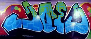
Comments please on my work, by gozgoz on Feb 5, 2008 12:03:28 GMT 1, Something i whipped up over the past month or so. The letters are all woodcut handcut by myself and individually printed with acrylic and watercolour to get a loose transparentish effect.
Frame was a frame from Habitat of which the glass i accidentally smashed so i decided to put it to good use...
Comments NOW! 
Im not too used to showing my work up on here cos ive seen how people get totally slammed on and tore apart.... but oh well... what the hell..

Something i whipped up over the past month or so. The letters are all woodcut handcut by myself and individually printed with acrylic and watercolour to get a loose transparentish effect. Frame was a frame from Habitat of which the glass i accidentally smashed so i decided to put it to good use... Comments NOW! Im not too used to showing my work up on here cos ive seen how people get totally slammed on and tore apart.... but oh well... what the hell.. |
|
Nuno
Junior Member
Posts • 1,095
Likes • 479
November 2007
|
Comments please on my work, by Nuno on Feb 5, 2008 12:06:11 GMT 1, i think its pretty cool goz
i think its pretty cool goz
|
|
gozgoz
Junior Member
Posts • 1,617
Likes • 7
September 2007
|
Comments please on my work, by gozgoz on Feb 5, 2008 12:06:24 GMT 1, A bit of background - it was done because i was feeling particularly homesick one day... Singapore being my home and now im residing in London. So i decided to do something for myself. I think thats also why home is in inverted commas cos its not really my home.
i also wanted to relate that transient/permanent "home away from home" meaning with the sloppy painting in the background, the loose woodcut print, but yet with strong distinct brushstrokes.
Ok enough art skool rubbish. I could have used the words "postmodern" and "juxtapose" but i refrain.
A bit of background - it was done because i was feeling particularly homesick one day... Singapore being my home and now im residing in London. So i decided to do something for myself. I think thats also why home is in inverted commas cos its not really my home. i also wanted to relate that transient/permanent "home away from home" meaning with the sloppy painting in the background, the loose woodcut print, but yet with strong distinct brushstrokes. Ok enough art skool rubbish. I could have used the words "postmodern" and "juxtapose" but i refrain. |
|
gozgoz
Junior Member
Posts • 1,617
Likes • 7
September 2007
|
Comments please on my work, by gozgoz on Feb 5, 2008 12:08:27 GMT 1, I was thinking of making it as a print too. Im really into woodcut lettering.... but i'lll hate for anyone to do a EINE comparison and say im ripping him off cos its drastically different style altogether.
ok. im gonna log out now and do some work. and when i come back i expect to see some serious comments and intense debate about flipping/anti-war/i hate u goz/goz sucks/arrogant goz is at it again! conversations.
Comments NOW DAMMIT!
I was thinking of making it as a print too. Im really into woodcut lettering.... but i'lll hate for anyone to do a EINE comparison and say im ripping him off cos its drastically different style altogether.
ok. im gonna log out now and do some work. and when i come back i expect to see some serious comments and intense debate about flipping/anti-war/i hate u goz/goz sucks/arrogant goz is at it again! conversations.
Comments NOW DAMMIT!
|
|
|
|
Comments please on my work, by slowmo on Feb 5, 2008 12:09:03 GMT 1, Its very nice Gozgoz, top marks
Its very nice Gozgoz, top marks
|
|
gozgoz
Junior Member
Posts • 1,617
Likes • 7
September 2007
|
Comments please on my work, by gozgoz on Feb 5, 2008 12:24:00 GMT 1, Thanks guys!
really made my day!
wahey!
i can take criticism too. so let rip all of you silent dissenting minority/majority!
Thanks guys!
really made my day!
wahey!
i can take criticism too. so let rip all of you silent dissenting minority/majority!
|
|
|
|
Joe J
New Member
Posts • 723
Likes • 0
March 2007
|
Comments please on my work, by Joe J on Feb 5, 2008 12:47:15 GMT 1, I understand how it is to feel homesick Gozgoz. I sympathise with you.
I was living for 7 years between Bangkok and Kuala Lumpur and occasionally I felt homesick... on those occassions I just threw myself into women and I got past all of that quickly ... I never thought of wood-cutting and painting, I wish I did, it would of saved me some awkward morning after headaches... Crikey!
I took up DJ'n again. That helped with the homesickness too... Girls love a DJ!
I might add I had to re-adjust to the Australian culture when I moved back home.
Oh yeah comments... I think overall the piece is excellent.
Now go find yourself some fat Aussie backpacker bird in Earls Court and tell her about your clean hot shower and nice comfy bed back at your house...
I understand how it is to feel homesick Gozgoz. I sympathise with you.
I was living for 7 years between Bangkok and Kuala Lumpur and occasionally I felt homesick... on those occassions I just threw myself into women and I got past all of that quickly ... I never thought of wood-cutting and painting, I wish I did, it would of saved me some awkward morning after headaches... Crikey!
I took up DJ'n again. That helped with the homesickness too... Girls love a DJ!
I might add I had to re-adjust to the Australian culture when I moved back home.
Oh yeah comments... I think overall the piece is excellent.
Now go find yourself some fat Aussie backpacker bird in Earls Court and tell her about your clean hot shower and nice comfy bed back at your house...
|
|
|
|
Comments please on my work, by silverfox on Feb 5, 2008 13:19:18 GMT 1, Good effort. Needs work though. Not sure about the bleeding on the lettering, lets it down. May look better if you created a stencil and sprayed it, would have added more punch. Re the typeface maybe try these "Rosewood std" or "Jf Ringmaster" they are similar but in my opinion better, you can download these for free from dafont.com. Oh yeah for your patterns (floral/rose) hit flickr create an account type "Floral vector" in the search. Again you can download for free and they are vector you can blow these up as big as you want without losing res. Keep up the good work.
Good effort. Needs work though. Not sure about the bleeding on the lettering, lets it down. May look better if you created a stencil and sprayed it, would have added more punch. Re the typeface maybe try these "Rosewood std" or "Jf Ringmaster" they are similar but in my opinion better, you can download these for free from dafont.com. Oh yeah for your patterns (floral/rose) hit flickr create an account type "Floral vector" in the search. Again you can download for free and they are vector you can blow these up as big as you want without losing res. Keep up the good work.
|
|
gozgoz
Junior Member
Posts • 1,617
Likes • 7
September 2007
|
Comments please on my work, by gozgoz on Feb 5, 2008 14:22:17 GMT 1, wow thats really nice of u. thanks!
yeah i just created the font outta something i remember seeing as a child back home at a circus... and the rose was a random doodle...
thanks!
wow thats really nice of u. thanks!
yeah i just created the font outta something i remember seeing as a child back home at a circus... and the rose was a random doodle...
thanks!
|
|
wimpy
New Member
Posts • 412
Likes • 1
November 2007
|
Comments please on my work, by wimpy on Feb 5, 2008 14:26:09 GMT 1, ho say, ah!
damn siao on 1
hopefully you song now
ho say, ah!
damn siao on 1
hopefully you song now
|
|
Gentle Mental
Junior Member
Posts • 2,815
Likes • 854
Member is Online
May 2007
|
Comments please on my work, by Gentle Mental on Feb 5, 2008 15:44:09 GMT 1, oh my goodness! i tot i onli one!
er... how many of us out there ah?
yes. mr gozgoz i like the strange "circus" feel you've given to your word "home"... very carnival-ish... home is where you lay your hat, no?
i would like more if it were more intricate... i say let the wood cut go all crazy carnival detailin' fill all the white space up... like a crazy circus poster, ya home can be terribly ironic.
g'day fellow citizen!
oh my goodness! i tot i onli one!
er... how many of us out there ah?
yes. mr gozgoz i like the strange "circus" feel you've given to your word "home"... very carnival-ish... home is where you lay your hat, no?
i would like more if it were more intricate... i say let the wood cut go all crazy carnival detailin' fill all the white space up... like a crazy circus poster, ya home can be terribly ironic.
g'day fellow citizen!
|
|
gozgoz
Junior Member
Posts • 1,617
Likes • 7
September 2007
|
Comments please on my work, by gozgoz on Feb 5, 2008 16:58:25 GMT 1, mmm..... let the woodcut go all over? thats actually an idea i was doodling with.
i wanted to make the words go HOMEHOMEHOMEHOMEHOME or something.
g'day to you too fellow sporean!
mmm..... let the woodcut go all over? thats actually an idea i was doodling with.
i wanted to make the words go HOMEHOMEHOMEHOMEHOME or something.
g'day to you too fellow sporean!
|
|
wimpy
New Member
Posts • 412
Likes • 1
November 2007
|
Comments please on my work, by wimpy on Feb 5, 2008 17:17:32 GMT 1, If you do that, make sure to leave a fair amount of uncut space around the letters so they pop out. You can get some great depth going that way.
And I am an ang moh, but have some good singa friends. I don't know where I'd be today without being taught "bo lj", "pcb" and other goodies that allow me to offend people without them knowing any better.
Keep up the good work, goz.
Sincerely,
Cao Botak
If you do that, make sure to leave a fair amount of uncut space around the letters so they pop out. You can get some great depth going that way.
And I am an ang moh, but have some good singa friends. I don't know where I'd be today without being taught "bo lj", "pcb" and other goodies that allow me to offend people without them knowing any better.
Keep up the good work, goz.
Sincerely,
Cao Botak
|
|
gozgoz
Junior Member
Posts • 1,617
Likes • 7
September 2007
|
Comments please on my work, by gozgoz on Feb 5, 2008 17:19:05 GMT 1, whats uncut space?
heh... gigglegiggle... pcb.. heh...
whats uncut space?
heh... gigglegiggle... pcb.. heh...
|
|
|
|
wimpy
New Member
Posts • 412
Likes • 1
November 2007
|
Comments please on my work, by wimpy on Feb 5, 2008 17:26:53 GMT 1, Sorry. I meant just leave your white background around it and then maybe do a line a few cm out and fade out with some cross-hatching. Didn't mean uncut, but rather unprinted.
Sorry. I meant just leave your white background around it and then maybe do a line a few cm out and fade out with some cross-hatching. Didn't mean uncut, but rather unprinted.
|
|
gozgoz
Junior Member
Posts • 1,617
Likes • 7
September 2007
|
Comments please on my work, by gozgoz on Feb 5, 2008 18:15:37 GMT 1, Should i use less watery paint? less translucent?
Should i use less watery paint? less translucent?
|
|
wimpy
New Member
Posts • 412
Likes • 1
November 2007
|
Comments please on my work, by wimpy on Feb 5, 2008 18:45:25 GMT 1, Heck, no. Point is to use the cutting/design itself to get the effect rather than the ink.
I really dig the effect you got out of whatever mixture it was. Only thing with watery stuff is you have to be careful rolling it on so that you don't fill up your cuts. Plus, the positive to translucent stuff is how cool it will look if you do a few layers of overprinting.
Heck, no. Point is to use the cutting/design itself to get the effect rather than the ink.
I really dig the effect you got out of whatever mixture it was. Only thing with watery stuff is you have to be careful rolling it on so that you don't fill up your cuts. Plus, the positive to translucent stuff is how cool it will look if you do a few layers of overprinting.
|
|
gozgoz
Junior Member
Posts • 1,617
Likes • 7
September 2007
|
Comments please on my work, by gozgoz on Feb 5, 2008 19:04:10 GMT 1, i like it cos it somehow made the letters look almost organic... not sure if u can see it but it looks vein-y.
i like it cos it somehow made the letters look almost organic... not sure if u can see it but it looks vein-y.
|
|
plasticfork
New Member
Posts • 44
Likes • 0
November 2007
|
Comments please on my work, by plasticfork on Feb 5, 2008 20:48:18 GMT 1, I like the "O" letter the best - it has a very sweet-like quality. The over all watery aspect of the piece is nice and comes across as very organic - I might perhaps suggest that an addition of the top bordering at the bottom could add a more finished feel to the piece but hey what do I know...good work
I like the "O" letter the best - it has a very sweet-like quality. The over all watery aspect of the piece is nice and comes across as very organic - I might perhaps suggest that an addition of the top bordering at the bottom could add a more finished feel to the piece but hey what do I know...good work
|
|
uac
New Member
Posts • 123
Likes • 0
February 2008
|
Comments please on my work, by uac on Feb 5, 2008 22:29:16 GMT 1, WTF
WTF
|
|
gozgoz
Junior Member
Posts • 1,617
Likes • 7
September 2007
|
Comments please on my work, by gozgoz on Feb 6, 2008 11:39:55 GMT 1, Heck, no. Point is to use the cutting/design itself to get the effect rather than the ink. I really dig the effect you got out of whatever mixture it was. Only thing with watery stuff is you have to be careful rolling it on so that you don't fill up your cuts. Plus, the positive to translucent stuff is how cool it will look if you do a few layers of overprinting.
Good stuff. lemme try the over printing. thanks again for the advice guys.
Heck, no. Point is to use the cutting/design itself to get the effect rather than the ink. I really dig the effect you got out of whatever mixture it was. Only thing with watery stuff is you have to be careful rolling it on so that you don't fill up your cuts. Plus, the positive to translucent stuff is how cool it will look if you do a few layers of overprinting. Good stuff. lemme try the over printing. thanks again for the advice guys. |
|