|
|
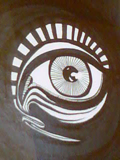
NEW art by Agent Provocateur..., by Agent Provocateur on Mar 23, 2008 13:33:03 GMT 1, good morning all... i thought i'd post a couple of my early stencils for your comments!
i posted one of my pieces for the first time on the board yesterday, a little tongue-in-cheek easter canvas (in the wrong place  ) called 'second coming' (see the thread 'happy easter... with an irreverant twist') and got some positive comments and advice ) called 'second coming' (see the thread 'happy easter... with an irreverant twist') and got some positive comments and advice  one of which was to take my stealth mode off and post more of my work(!), thanks gvd. one of which was to take my stealth mode off and post more of my work(!), thanks gvd.
so below are two early stencils on card (sorry for the poor quality images, phone camera i'm afraid)...
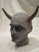
'limited edition' a comment on our greed and avarice for exclusive and expensive limited editions without a thought for the effect on poorer economies and the wildlife
'second coming' this is a powerful sketch for the similarly titled canvas (see my explanation at the end of the thread mentioned above)... i really like the weight of line and blur
let me know if you have any feelings either way... as usual, comments (positive and negative), advice, indifference, swearing and rapture will be taken on the chin ;D
hope you're all having a cosy easter indoors!
AP


good morning all... i thought i'd post a couple of my early stencils for your comments! i posted one of my pieces for the first time on the board yesterday, a little tongue-in-cheek easter canvas (in the wrong place ) called 'second coming' (see the thread 'happy easter... with an irreverant twist') and got some positive comments and advice one of which was to take my stealth mode off and post more of my work(!), thanks gvd. so below are two early stencils on card (sorry for the poor quality images, phone camera i'm afraid)... 'limited edition' a comment on our greed and avarice for exclusive and expensive limited editions without a thought for the effect on poorer economies and the wildlife 'second coming' this is a powerful sketch for the similarly titled canvas (see my explanation at the end of the thread mentioned above)... i really like the weight of line and blur let me know if you have any feelings either way... as usual, comments (positive and negative), advice, indifference, swearing and rapture will be taken on the chin ;D hope you're all having a cosy easter indoors! AP |
|
GVD
Artist
New Member

Posts • 718
Likes • 2
April 2007
|
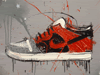
NEW art by Agent Provocateur..., by GVD on Mar 23, 2008 13:49:21 GMT 1, Looks pretty good !
I'd give the tiger some colour, and keep the nike sign white, so it really stands out. But good effort for you first couple of stencils .
Looks pretty good ! I'd give the tiger some colour, and keep the nike sign white, so it really stands out. But good effort for you first couple of stencils . |
|
|
|
NEW art by Agent Provocateur..., by Agent Provocateur on Mar 23, 2008 14:31:52 GMT 1, cheers gvd
i have also done this white version... but not just the logo. one of my reasons for not separating the logo from the tiger was the simplicity and singularity of the tiger/logo combination. i love playing with positive and negative shapes. similary with the lack of background, i placed the tiger in the right of the composition to give the feeling of space and movement without having to include any environmental forms.

the idea behind all my early work was to see just how simple the shapes and lines could be whilst still conveying the message clearly. colour, texture and mixed media follows these early studies...
cheers gvd i have also done this white version... but not just the logo. one of my reasons for not separating the logo from the tiger was the simplicity and singularity of the tiger/logo combination. i love playing with positive and negative shapes. similary with the lack of background, i placed the tiger in the right of the composition to give the feeling of space and movement without having to include any environmental forms. the idea behind all my early work was to see just how simple the shapes and lines could be whilst still conveying the message clearly. colour, texture and mixed media follows these early studies... |
|
funyoung
Junior Member
Posts • 1,040
Likes • 20
February 2008
|
NEW art by Agent Provocateur..., by funyoung on Mar 23, 2008 16:53:07 GMT 1, Like the tiger but like GVD I feel the Nike sign needs to be bought out.
Understand your reasons for not doing this however.
What happens if you had the Nike sign in black with the rest the same? Or make in black and smaller?
My reason for this is that on first glance it looked as though you had 'missed a bit' before realising it was the nike logo.
I prefer the first image (white background) to the second (cardboard) as it looks stronger. Turns into a bengalese tiger (is that right?) in the second one.
Like the tiger but like GVD I feel the Nike sign needs to be bought out.
Understand your reasons for not doing this however.
What happens if you had the Nike sign in black with the rest the same? Or make in black and smaller?
My reason for this is that on first glance it looked as though you had 'missed a bit' before realising it was the nike logo.
I prefer the first image (white background) to the second (cardboard) as it looks stronger. Turns into a bengalese tiger (is that right?) in the second one.
|
|
|
|
NEW art by Agent Provocateur..., by cashman on Mar 23, 2008 18:18:22 GMT 1, great efforts bro, keep it up !!
keep going as you are, trial and error is the only way
peace
great efforts bro, keep it up !! keep going as you are, trial and error is the only way peace |
|
Natas
New Member
Posts • 493
Likes • 3
June 2007
|
NEW art by Agent Provocateur..., by Natas on Mar 23, 2008 19:02:35 GMT 1, Agree with GVD on the need for colour on the tiger on the other the image seems to need some background to fill the space.
Agree with GVD on the need for colour on the tiger on the other the image seems to need some background to fill the space.
|
|
|
|
|
|
NEW art by Agent Provocateur..., by Agent Provocateur on Mar 23, 2008 21:53:29 GMT 1, excellent, thanks guys... i have a few ideas after your comments that may make the image work a lot better. will post when i have worked out how i'm going to bloody do it!
seriously tho, much apppreciated ;D if it all comes off i'm thinking about a free limited edition for you lot... that's if you like it!
i will keep you updated.
time for another creative london pride i think 
excellent, thanks guys... i have a few ideas after your comments that may make the image work a lot better. will post when i have worked out how i'm going to bloody do it! seriously tho, much apppreciated ;D if it all comes off i'm thinking about a free limited edition for you lot... that's if you like it! i will keep you updated. time for another creative london pride i think |
|
Natas
New Member
Posts • 493
Likes • 3
June 2007
|
NEW art by Agent Provocateur..., by Natas on Mar 23, 2008 23:19:21 GMT 1, Thats very kind and very generous, of course it would be rude to turn it down. Good luck and look forward to seeing the final versions.
Thats very kind and very generous, of course it would be rude to turn it down. Good luck and look forward to seeing the final versions.
|
|
funyoung
Junior Member
Posts • 1,040
Likes • 20
February 2008
|
NEW art by Agent Provocateur..., by funyoung on Mar 24, 2008 1:47:34 GMT 1, now london pride is a ruddy good pint!
now london pride is a ruddy good pint!
|
|
BK83
Junior Member
Posts • 1,604
Likes • 10
October 2006
|
NEW art by Agent Provocateur..., by BK83 on Mar 24, 2008 19:23:30 GMT 1, AP, I dont think anything needs changing with that tiger piece! The simple black layer stencil works perfectly. The Nike logo is subtle, but yet completely understood, no need for overemphasis. Similarly, the version you have shown with a white silhouette layer detracts from the piece also.
Leave it as is from the original picture at the top. That is absolutely awesome! simple as that.
AP, I dont think anything needs changing with that tiger piece! The simple black layer stencil works perfectly. The Nike logo is subtle, but yet completely understood, no need for overemphasis. Similarly, the version you have shown with a white silhouette layer detracts from the piece also.
Leave it as is from the original picture at the top. That is absolutely awesome! simple as that.
|
|
Run Pig Run
Junior Member
Posts • 2,437
Likes • 9
January 2006
|
NEW art by Agent Provocateur..., by Run Pig Run on Mar 25, 2008 18:23:12 GMT 1, AP, I dont think anything needs changing with that tiger piece! The simple black layer stencil works perfectly. The Nike logo is subtle, but yet completely understood, no need for overemphasis. Similarly, the version you have shown with a white silhouette layer detracts from the piece also. Leave it as is from the original picture at the top. That is absolutely awesome! simple as that.
i'm with you...keep it simple.
AP, I dont think anything needs changing with that tiger piece! The simple black layer stencil works perfectly. The Nike logo is subtle, but yet completely understood, no need for overemphasis. Similarly, the version you have shown with a white silhouette layer detracts from the piece also. Leave it as is from the original picture at the top. That is absolutely awesome! simple as that. i'm with you...keep it simple. |
|
|
|
NEW art by Agent Provocateur..., by Agent Provocateur on Mar 25, 2008 19:36:35 GMT 1, thanks for all the great comments ;D
although there are differing opinions about whether to make it more detailed or not... i have just completed a slightly different version with a small amount of background so the tiger doesn't look like it's floating... and with a bit of added colour (aka like some of the trainers themselves, supbtle tho!).
i like the simplicity, the movement, colour hint and how the nike logo seems to be part of the tigers fur rather than added on. sorry for the bad pics, not good light and still on the phone camera ahhhh (hope you can see them ok).
hav a look...

and his brother...

for all you guys who have already expressed a wish to get hold of one... i will endevour to knuckle down a produce a little 'special edition' just for you! 
bear with me whilst i try and get them together... i'll contact you with all the details (personal photo of your tiger, edition, postage etc).
AP
thanks for all the great comments ;D although there are differing opinions about whether to make it more detailed or not... i have just completed a slightly different version with a small amount of background so the tiger doesn't look like it's floating... and with a bit of added colour (aka like some of the trainers themselves, supbtle tho!). i like the simplicity, the movement, colour hint and how the nike logo seems to be part of the tigers fur rather than added on. sorry for the bad pics, not good light and still on the phone camera ahhhh (hope you can see them ok). hav a look... and his brother... for all you guys who have already expressed a wish to get hold of one... i will endevour to knuckle down a produce a little 'special edition' just for you! bear with me whilst i try and get them together... i'll contact you with all the details (personal photo of your tiger, edition, postage etc). AP |
|
Maxie
New Member
Posts • 360
Likes • 1
December 2007
|
NEW art by Agent Provocateur..., by Maxie on Mar 25, 2008 19:40:21 GMT 1, i like it a lot
i like it a lot
|
|
GVD
Artist
New Member
Posts • 718
Likes • 2
April 2007
|
NEW art by Agent Provocateur..., by GVD on Mar 25, 2008 19:40:53 GMT 1, looks cool mate, i like the adition of the colour.
looks cool mate, i like the adition of the colour.
|
|
|
|
Michael Jacob
Artist
Junior Member
Posts • 2,049
Likes • 29
October 2006
|
NEW art by Agent Provocateur..., by Michael Jacob on Mar 25, 2008 19:42:56 GMT 1, Great! The background addition really helps, adds good depth to the piece!
Great! The background addition really helps, adds good depth to the piece!
|
|
|
|
NEW art by Agent Provocateur..., by cashman on Mar 25, 2008 19:48:56 GMT 1, Great! The background addition really helps, adds good depth to the piece!
not really feeling the shadows bro....seems a bit too much
Great! The background addition really helps, adds good depth to the piece! not really feeling the shadows bro....seems a bit too much |
|
|
|
NEW art by Agent Provocateur..., by Agent Provocateur on Mar 25, 2008 19:57:05 GMT 1, really sorry bout the bad pics... i'm going to crank up the gf's digi camera and take some better ones!
hopefully all the detail and colour will come through then.
really sorry bout the bad pics... i'm going to crank up the gf's digi camera and take some better ones!
hopefully all the detail and colour will come through then.
|
|
funyoung
Junior Member
Posts • 1,040
Likes • 20
February 2008
|
NEW art by Agent Provocateur..., by funyoung on Mar 25, 2008 20:24:01 GMT 1, you didn't happen to get one with just hint of colour and no background did you? (before you added background or something)
I'm with cashman on not being 100% sure about shadow/background but love the touch of colour.
you didn't happen to get one with just hint of colour and no background did you? (before you added background or something)
I'm with cashman on not being 100% sure about shadow/background but love the touch of colour.
|
|
funyoung
Junior Member
Posts • 1,040
Likes • 20
February 2008
|
NEW art by Agent Provocateur..., by funyoung on Mar 25, 2008 20:24:34 GMT 1, oh yes - and can i get one please when the time is right ?
oh yes - and can i get one please when the time is right ?
|
|
|
|
NEW art by Agent Provocateur..., by Agent Provocateur on Mar 25, 2008 20:49:31 GMT 1, here are the better photos... 


i have both stencils now... sans background and background, so can do either 
|
|
|
|
NEW art by Agent Provocateur..., by snakes on Mar 25, 2008 21:21:29 GMT 1, Absolutely bloody cracking.
Great stuff agent P
Absolutely bloody cracking.
Great stuff agent P
|
|
Natas
New Member
Posts • 493
Likes • 3
June 2007
|
NEW art by Agent Provocateur..., by Natas on Mar 25, 2008 21:25:46 GMT 1, Looks great, consider approved
Looks great, consider approved
|
|
|
|
bunnyboy
New Member
Posts • 619
Likes • 9
Member is Online
September 2007
|
NEW art by Agent Provocateur..., by bunnyboy on Mar 25, 2008 22:31:44 GMT 1, This looks really nice now - well done. Simple but effective. I like the way that it's just a hint of colour. Draws the eye without being too obvious. Just enough background too. That image on cardboard would look v. cool. Nice work.
This looks really nice now - well done. Simple but effective. I like the way that it's just a hint of colour. Draws the eye without being too obvious. Just enough background too. That image on cardboard would look v. cool. Nice work.
|
|
|
|
NEW art by Agent Provocateur..., by Agent Provocateur on Mar 25, 2008 23:13:34 GMT 1, excellent
the good thing is i'm happy with both... the simple tiger on it's own (no white silhouette) with black stripes and hint of red... and the tiger with background and the same colouring. coolio... 
right, well as of now, 22:00, i will draw up a list of people that i'll do one for (only from the people already promised or who have professed a wish for one) and will contact you individually checking which sort of tiger you'd like (background, no background, just black stripes or with a hint of colour).
bear with me, i'll get things going asap.
AP
excellent the good thing is i'm happy with both... the simple tiger on it's own (no white silhouette) with black stripes and hint of red... and the tiger with background and the same colouring. coolio... right, well as of now, 22:00, i will draw up a list of people that i'll do one for (only from the people already promised or who have professed a wish for one) and will contact you individually checking which sort of tiger you'd like (background, no background, just black stripes or with a hint of colour). bear with me, i'll get things going asap. AP |
|
Heavyconsumer
Junior Member
Posts • 4,974
Likes • 5
February 2008
|
NEW art by Agent Provocateur..., by Heavyconsumer on Mar 26, 2008 6:18:01 GMT 1, Hi mate,
I really like your first pic of the Tiger, nice stencil. I didn't agree that it needed the touching up, but the final rsult is also very attractive. Good luck with your work man! Most of all, keep enjoying it!
Hi mate,
I really like your first pic of the Tiger, nice stencil. I didn't agree that it needed the touching up, but the final rsult is also very attractive. Good luck with your work man! Most of all, keep enjoying it!
|
|
|
|
NEW art by Agent Provocateur..., by raniator on Mar 27, 2008 11:15:10 GMT 1, I can't see any underwear. Don't waste my time again 
I can't see any underwear. Don't waste my time again |
|
Sacked...
Full Member
Posts • 7,978
Likes • 1,338
October 2007
|
NEW art by Agent Provocateur..., by Sacked... on Mar 29, 2008 21:34:35 GMT 1, i likee
i likee
|
|
maadbeats
Junior Member
Posts • 2,272
Likes • 19
September 2007
|
NEW art by Agent Provocateur..., by maadbeats on Mar 29, 2008 23:34:16 GMT 1, Im diggin the Tiger Style. When are you going to start selling?
Im diggin the Tiger Style. When are you going to start selling?
|
|
|
|
NEW art by Agent Provocateur..., by Oliver Winconek on Apr 6, 2008 18:07:28 GMT 1, Great work, I love the tiger. It's one of those pieces that works well because of it's simplicity. A strong stencil, I look forward to seeing more
Great work, I love the tiger. It's one of those pieces that works well because of it's simplicity. A strong stencil, I look forward to seeing more
|
|
|
|
NEW art by Agent Provocateur..., by Agent Provocateur on Apr 14, 2008 22:19:45 GMT 1, Hey, thanks glad it arrived safe and sound!
Hey, thanks glad it arrived safe and sound! |
|


 ) called 'second coming' (see the thread 'happy easter... with an irreverant twist') and got some positive comments and advice
  one of which was to take my stealth mode off and post more of my work(!), thanks gvd.